 My article, Visualizing Water Infrastructure with Sankey Maps: a Case Study of Mapping the Los Angeles Aqueduct, California, dives deep into the theory and practices used to create the signature Sankey map of the Aqueduct Futures exhibit with a peer reviewed research article in Journal of Maps. You can read the full article (it’s open-access) at DOI: 10.1080/17445647.2018.1473815.
Special thanks to College of Environmental Design for providing the open access article publication charge.
Suggested Citation:
Lehrman, Barry. 2018. ‘Visualizing Water Infrastructure with Sankey Maps: a Case Study of Mapping the Los Angeles Aqueduct, California’. Journal of Maps, 14(1), 52-64. DOI: 10.1080/17445647.2018.1473815.
Abstract
Creating resilience for urban water supply systems requires innovative thematic visualizations of the interface between infrastructure, ecology, and culture to viscerally engage lay audiences in the policy making process. Sankey maps (a hybrid Sankey diagram/flow map) embed the systemic accounting of flows between sources and sinks into a spatial framework. This allows a hierarchy of visual variables to encode environmental conditions and historical data, providing a rich multi-variate context supporting public discourse, policy making, and system operations. The article features a Sankey map of the Los Angeles Aqueduct system (California, USA) (not to scale).

The LAA Sankey Map on display at Los Angeles Contemporary Exhibitions as part of After the Aqueduct.
Journal of Maps only could include 5 figures with the article + the supplemental map, so I was unable to share any of the cited precedent flow maps and Sankey diagrams. So here they are with a few bonuses.
Los Angeles Aqueduct Maps
Los Angeles Department of Water and Power provides a (very) poorly designed real-time status map of the Los Angeles Aqueduct, which was one of the inspirations for creating my Sankey Map.
My critique of LADWP’s map/website start with the failure to indicate the units for data. Is flow being reported in cubic feet per second? Acre-feet? Gallons? Then there are the reservoir status numbers, are they elevation in feet of the water? Volume in Acre-Feet?

Then there is a lack of context to understand what these numbers mean. How these numbers relate to historical averages, regulatory limits, or capacity of the Aqueduct? How much precipitation has fallen in the watershed and availability of water to export?
Then there is the inconsistent scales for each map and the clunky need to load each segment separately instead of scrolling along the length of the Aqueduct.
Historic Maps of the LAA
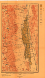
Of the various historic maps delineating the route of the Los Angeles Aqueduct, a few are significant for their beauty and craft: the City of Los Angeles Board of Water and Power Commissioners’ (1908) topographic map, Mulholland’s plan and section (1916, Plates No. 4 & 5) which charted construction progress, and The California Water Atlas’s (Kahrl, 1979, pp. 34–35) comparison of the LAA with the Colorado River Aqueduct. Except for Kahrl’s, these maps lack flow and temporal data (such as peak and average flows, or capacity).
Likewise, AF’s initial catalyst for designing a compelling and visceral quantitative spatial visualization of the Aqueduct was the indecipherable diagrams provided by the Los Angeles Department of Water and Power on the real-time Aqueduct data web page (Los Angeles Department of Water and Power). LADWP’s ‘dashboard’ is all-but-indecipherable through poor design and a lack of units (to say nothing of providing historical context or attempting to make visible the quantities).

Los Angeles Aqueduct Sections/Profiles

LADWP. 1916. General Profile Los Angeles Aqueduct

1973 Second LAA Report
For the infrastructuralists and LAA scholars, it’s worth mentioning Aaron Forest’s 2002 thesis project: LA Aqueduct Atlas.
[Graphically] Mapping Time
A selection of the work identified by Aigner et al’s (2011) history of time-based graphs, from their comprehensive survey of ‘time-oriented’ visualization methods.

Minard’s 1869 Napoleon’s March (from Wikipedia).
Of the 101 contemporary typologies [defined by] Aigner et al. [see: timeviz.net], only 11 provide any degree of spatial organization (Flow Map, GeoTime, Helix Icons, Icons on Maps, Pencil Icons, Small Multiples, Space-Time Path, Time-Oriented Polygons on Maps, Time-Varying Hierarchies on Maps, Value Flow Map, and Vis-Stamp); the rest utilize abstract empirical or ordinal frames. All 11 (and most of the 101) appear to serve a narrow, expert audience; they fail to provide the qualities of legibility a lay audience needs, such as good graphic design.
Then there are Harold Fisk’s 1944 seminal maps of the Mississippi River’s meanders that inspired Anu Mather and Dilip Da Cuhna’s work:

Super high resolution versions of Fisk’s maps can be found at http://www.radicalcartography.net/index.html?fisk.
Sankey Diagrams
Flow Maps

Sankey Diagram from the USACE/Mississippi River Commission’s 1956 Project Design Flood. This widely distributed diagram with various derivatives such as this, yet no original report/document has been found.

USACE’s 1960 Mississippi Basin Freight from LOC.Gov
And to wrap up:


You must be logged in to post a comment.